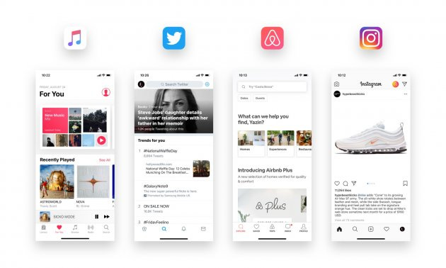
Have you ever wondered why every app looks and feels the same?
Rounded sans-serif fonts… packaged as a custom wordmark, like Goldman Sans (i wish this were a parody site but alas…)
Bold “whimsical” statements and provocative images…
Minimal interfaces and stripped down choices…
Clean workflows…
Everything looks and feels the same. Simple. Sleek. Safe.

Neutering Choice
As humans, we are wired to create, seek out, and reinforce patterns. And for some reason, this has permeated every element of the modern Silicon Valley design aesthetic, leading to a hellscape of pastel tones. It also doesn’t help that every app just emulates the most popular features of every other app like some twisted non-stop mash-up game where every app just becomes some frankenstein blend of every other app and then, issues a credit card. Because of course. And every startup at some point uses the same ten brand and design consulting firms, like Red Antler who literally created the blanding trend (a perjorative twist on branding, get it?) and is single handedly responsible for ruining adverts on the NYC subway.
Most apps we interact with rely on trained behavior patterns and behavioral loops that are designed to eliminate choice and friction, and to push you one step closer to the ultimate desired action - enter data in form. buy. subscribe. like.
What these apps are really trying to do with their bland design is remove the challenges presented by choice in a world where we already feel overwhelmed with information.
It’s the illusion of careful curation without actually curating anything, because you don’t even have choice to begin with.
For those who haven’t read it yet, I highly recommend reading Kyle Chayka’s “Welcome to Airspace” on why every hotel, AirBnB, home on apartment therapy, or otherwise commercial space now looks the same. Homogeneity in design space provides comfort and psychological safety. Sameness as a service minimizes the friction of moving between spaces. There are literally hundreds of startups funded to the tune of billions of dollars that will let you homogenize your space and turn it into AirSpace, like some twisted venture funded gentrification service that is delivered, as you by now will guess, via a blanded neutered app that looks like every other app.
Fucking great.
The Sameness is the Trap
I guess this post is a direct response to a statement I hear all the time.
“Crypto UX / UI sucks!” which is then immediately followed by “We must fix it and make it better / easier / faster / more intuitive to use!”
I must admit that I too, once, fell into this trap of believing that if we could fix THE UX! THE HORRORS! then the problems and challenges of crypto would melt away, and we would ascend to a utopian dream-land of sameness and blandness in soothing pastel colorways. Let me get some of those Figma designs and add in some Intercom chat and Shopify integration and add some nice Typeform flows mmhmmm.
Mass adoption here we come! Billions of people in “Africa” will use this app and be saved from the terrors of correspondent banking and Western Union! Pre-booking my chalet for Davos 2022 now.
All because this UX be smooth like buttah.
Crypto UX does Suck

But it does not need to be “fixed.”
Fixing implies there is a template.
Fixing implies there is a standard.
Fixing implies there is something wrong.
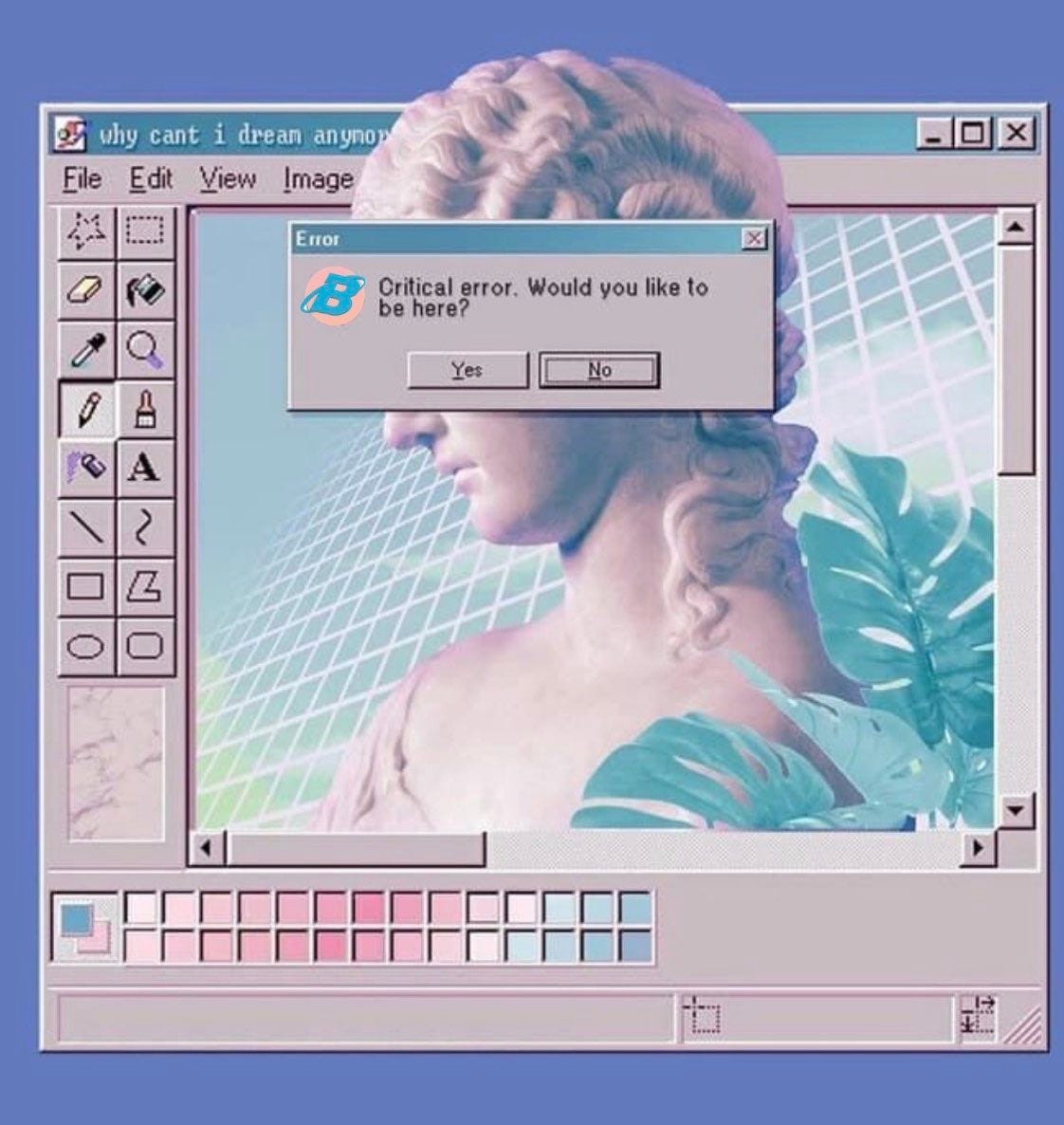
The whole point of crypto is opening up a design space that has previously been inaccessible. And in that process, a lack of consensus creates permission for new modalities outside of the bubble that started in Silicon Valley and has been exported to every start up and tech company around the world.
Instead of reinforcing the bubble, which by the way is INHERENTLY EXCLUSIONARY in its design, let’s shatter the bubble and reject the notion of standards entirely.
Money and banking hasn’t changed in three millennia, since Julius Caesar stamped his face on a gold coin (see here for that rant) and humans began building fortresses around these mounds of shiny metal like Gollum fiend-ing over the precious. Because pieces of shiny metal were all we had to transmit value over vast distances of space and time, we built an entire civilization around extracting, storing, securitizing, and later leveraging these shiny pieces of metal and later, literal pieces of paper that were memes representing the might of nation states.
What we’re trying to do in this little corner of the world is basically dismantle three millennia of that way of thinking and being, and reconstruct something entirely new that includes a re-design of social philosophy, monetary policy, compute infrastructure, energy infrastructure, payments infrastructure, and so much more.

Yes, crypto UX sucks if you compare it to (insert app name here). The complexities of going from building fortresses around humanity’s gold to building digital citadels around bitcoin’s mathematically verifiable promises are profound. The UX is an embodiment of this struggle. And that’s ok.
Lead me to the Promised Land, ye Designers
To engineer an effective solution to an incredibly complex, systemic problem is not easy. The thing that makes the crypto ecosystem so unique and so creative is the lack of consensus and norms, which by nature extends itself into design and user experience. There is a massive surface area to play with, because we’ve never built stuff like this before, and it still isn’t clear who we’re building for. If we’re building for institutions, shoving bitcoin into a fortress is certainly appealing in the short term, as evidenced by the fetish for HSMs and “cold storage” involving armed mountainside silos and heavily armored guards.
But over the long term, the design space needs to stay flexible.
Instead of cramming it into a narrow set of pre-defined standards of what experience should be, perhaps we should treat the crypto design space as emergent, evolutionary, and disruptive.
The audience who is actually using this stuff is incredible tolerant - users are willing to deal with any number of faults and shitty design in order to get to the underlying product or use case. Look at the DeFi design space, people are getting rugged on a regular basis for a myriad of code bugs and design flaws yet this doesn’t deter anyone - it just makes the space even more exciting because there is so much complexity that anyone with more than two functioning neurons in their brain can’t help but be utterly obsessed with it.
Not because it’s the same, but because it’s so different. And it should stay that way.
If we want to disrupt the experience people have with money, banking, and finance, we need to design an entirely new set of user experiences and behavioral loops. Trying to cram something so interesting into a narrowly constrained design space predicated on current user behavior is not only non-sensical, it’s destructive. Instead of normalizing, we should encourage deviance and bravery in design.
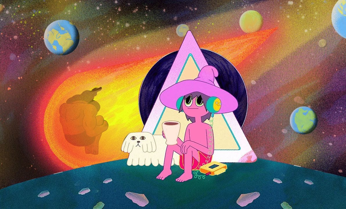
So reject your desire to be basic af, and take a walk on the wild side.
Who knows what we might find if we stay a while.
Thanks to Reggie James for feedback - your aesthetic is inspiring.


Love the point about Defi design space. Thanks!
Back in the 1990s when we started a company that was intended to bridge the gap between art and industry (Conchsense) - our web designer thought I was insane to want buttons that didn't fit the web standards of the 1997. Square buttons with text and drop shadow. I wanted shapes that morphed into new pages when you hovered over them that would disappear unless you clicked while on the shape. We were early (and young and inexperienced)and I allowed my team to convince me that I was being too revolutionary for our intended users - but as it turned out, having a website at all turned out to be too revolutionary for most of our users and clients - so at this point, I think we should have pushed the envelope - worst case scenario would have been the same result.